通过css实现div切角效果,在实际项目中要实现以下视觉效果,看图片。

html
<div class="corner"></div>
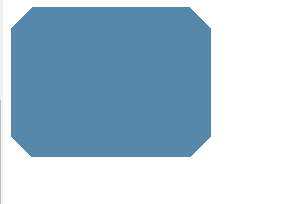
1. 一个切角
思路:如果我们要得到有一个切角的元素,我们只需要使用一个径向渐变就可以达到这个目标,这个渐变需要把一个透明色标放在切角处,然后再相同的位置设置另一个色标,并且把它的颜色设置成我们想要的背景色。
css:
.corner{
  width: 628px;
  height: 432px;
  background: #58a;
  background: linear-gradient(-45deg,transparent 20px,#58a 0);
}
效果图:

2. 两个切角
由上面的例子,我们很快想到这么写
css:
.corner {
	width: 200px;
	height: 150px;
	background: #58a;
	background: linear-gradient(-45deg, transparent 20px, #58a 0),
		linear-gradient(45deg, transparent 20px, #58a 0);
}
效果:

我们发现并没有达到我们想要的效果,这是因为左下角和右下角的两个渐变把对方覆盖了,所以只看到背景色。
于是我们想到了background-size,没错,如果把background-size的值设置为一半,是不是就可以了呢?事实证明还是不对,原因在于我们忘记把background-repeat关掉了,因而每层渐变图案各自平铺了两次,这导致背景仍然是相互覆盖的,只不过这次是因为背景平铺,所以修改后的代码是这样的:
css:
.corner{
  width: 200px;
  height: 150px;
  background: #58a;
  background: linear-gradient(-45deg,transparent 20px,#58a 0) right,
              linear-gradient(45deg,transparent 20px,#58a 0) left;
  background-size: 50% 100%;
  background-repeat: no-repeat;
}
效果:

3. 四个切角
css:
.corner{
  width: 200px;
  height: 150px;
  background: #58a;
  background: linear-gradient(-45deg,transparent 15px,#58a 0) bottom right,
              linear-gradient(45deg,transparent 15px,#58a 0) bottom left,
              linear-gradient(135deg,transparent 15px,#58a 0) top left,
              linear-gradient(-135deg,transparent 15px,#58a 0) top right;
  background-size: 50% 51%;
  background-repeat: no-repeat;
}
效果:
4. 弧形切角
css:
.corner{
  width: 200px;
  height: 150px;
  background: #58a;
  background: radial-gradient(circle at bottom right,transparent 15px,#58a 0) bottom right,
              radial-gradient(circle at bottom left,transparent 15px,#58a 0) bottom left,
              radial-gradient(circle at top left,transparent 15px,#58a 0) top left,
              radial-gradient(circle at top right,transparent 15px,#58a 0) top right;
  background-size: 50% 51%;
  background-repeat: no-repeat;
}
效果:

6. 使用clip-path实现
css:
.corner{
  width: 330px;
  height: 250px;
  background: url('http://www.duanlonglong.com/uploads/allimg/220111/1-220111100536140.png');
  background-size: cover;
  clip-path: polygon(20px 0,calc(100% - 20px) 0,
                    100% 20px,100% calc(100% - 20px),
                    calc(100% - 20px) 100%,20px 100%,
                    0 calc(100% - 20px),0 20px);
}
效果:
此文借鉴博客园 https://www.cnblogs.com/Anita-meng/p/7874615.html